Highlights
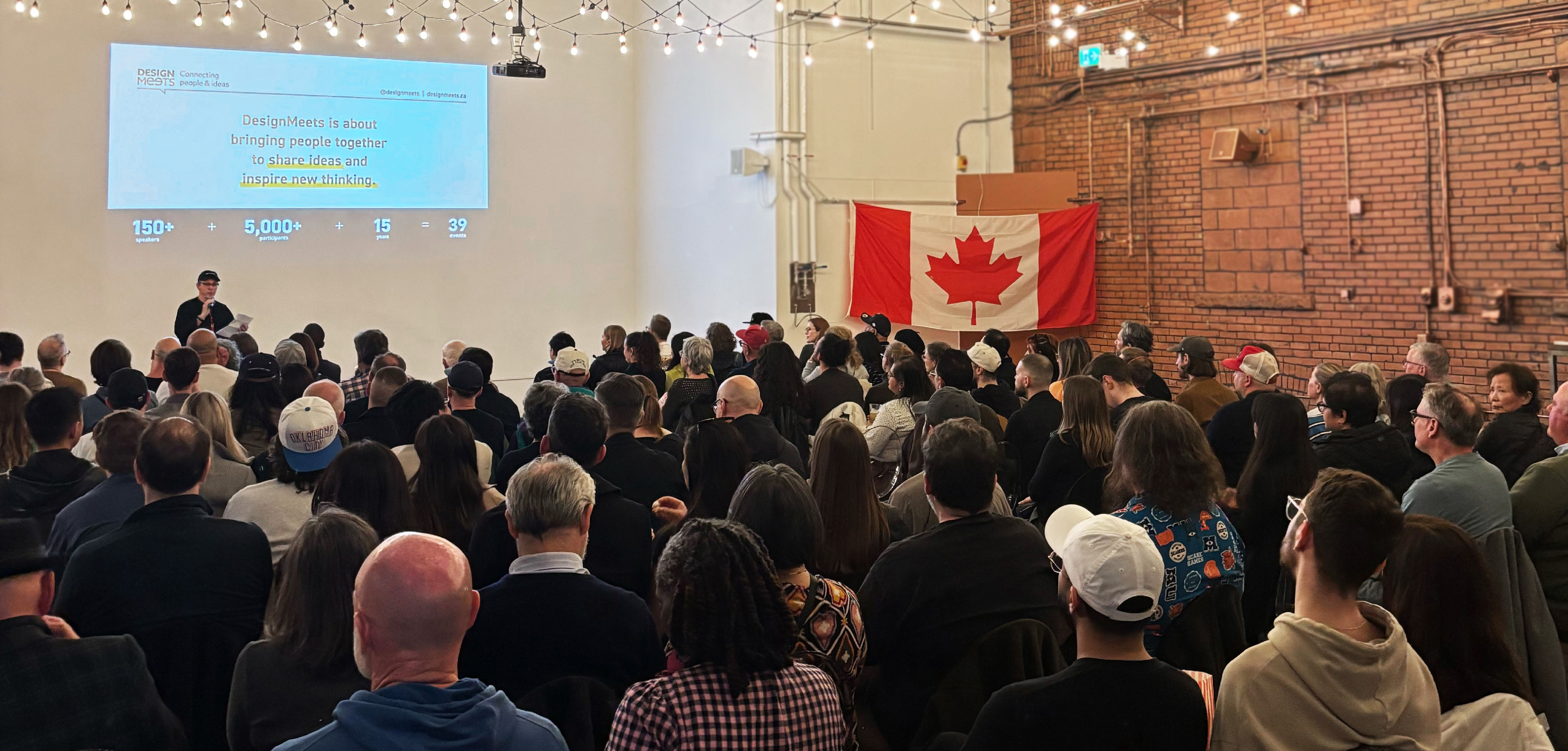
On Thursday evening, May 8th, design enthusiasts packed into Henderson Brewing Co. for a DesignMeets event unlike the others: a screening of the award-winning documentary Design Canada, followed by a live Q&A with the film’s director, Greg Durrell.
Design as Identity
Canadian visual symbols carry deep meaning, shaping our national story and reflecting how we see ourselves.
History Was Hiding in Plain Sight
Until 1965, Canada’s flag included the British Union Jack. Our visual identity is a relatively recent—and deliberate—design project.
Modernism and National Symbols
European modernist designers helped shape a uniquely Canadian design vocabulary during the 1960s and '70s.
Design as Storytelling
Logos aren’t just visual marks; they are windows into our political, cultural, and civic histories.
Design Legacies Evolve
Symbols like the maple leaf and Canada wordmark are not static—they continue to be reinterpreted and contested in new social contexts.
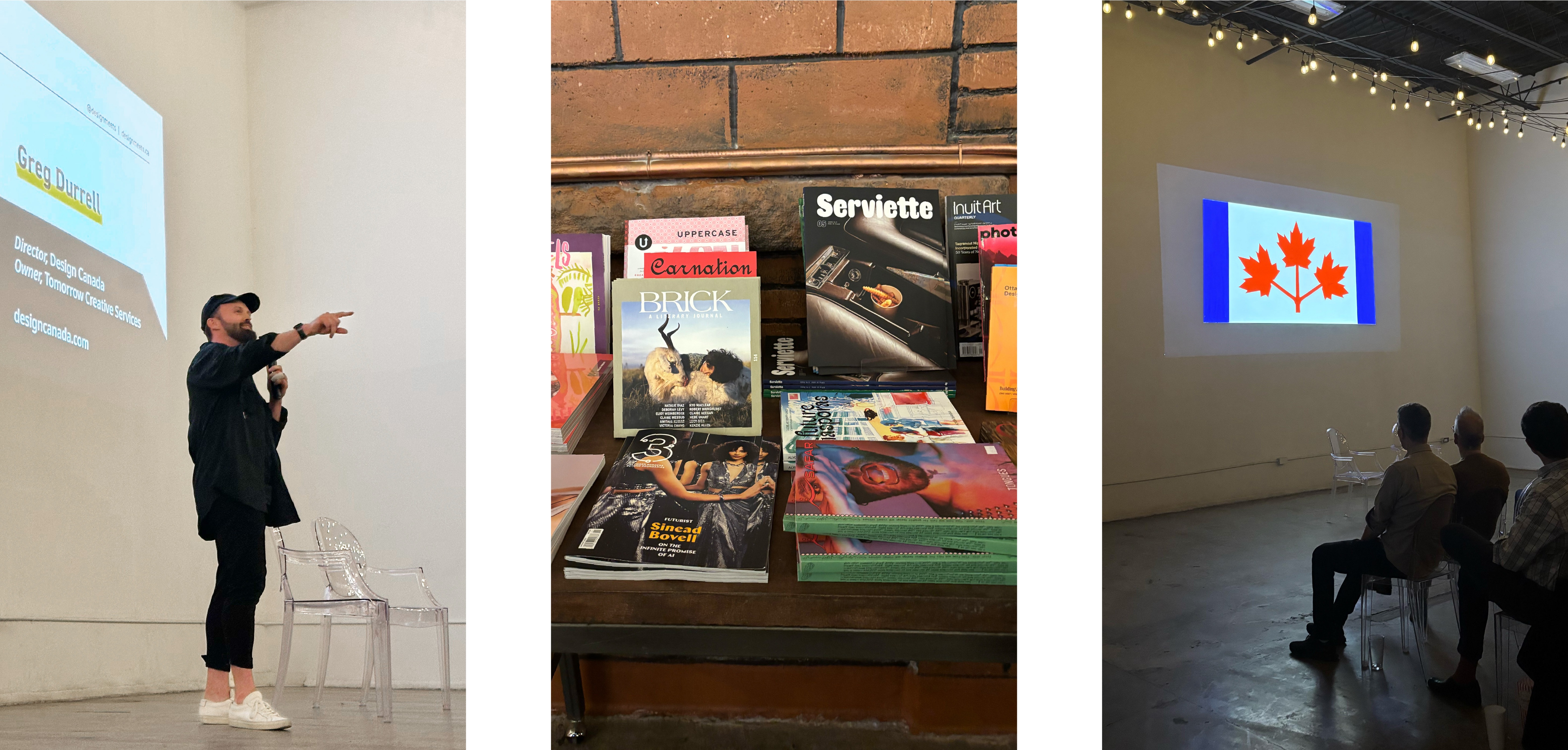
Guests enjoyed oysters, craft beer, an Issues Magazine pop-up shop and a curated Canadian vibe right down to the DJ Lincoln Baio (the director’s brother-in-law) spinning the pre and post screening tunes. But the focus of the Movie Night (aside from the free flowing popcorn) was decidedly on the emergence of a distinct visual design identity largely inspired by adoption of Canada’s iconic red and white maple leaf flag in 1965.
The Film: A Visual Reflection on Graphic Icons that Identify Canada as Canadian
Released in 2018, Design Canada charts the rise of modern graphic design in the 1960s and 70s when a new generation of designers shaped the country’s identity through logos, wordmarks, and flags. The film examines the creation of iconic symbols such as the Canadian flag, CBC logo, Government of Canada wordmark, CN Rail logo, the 1976 Montreal Olympics identity and even Canada’s hockey sweaters for the 1972 Summit Series. Six years in the making, much of it alone in the director’s living room, the film explores the question of whether Canadians designed these iconic symbols or did the symbols design Canada? For Greg, what began as a simple curiosity about how long has the maple leaf been synonymous with Canada, grew into a sweeping documentary about Canada’s visual self-definition during a pivotal time in its nation-building. Featuring the work of a host of Canadian design greats—Allan Fleming (CN logo), Georges Huel (1976 Summer Games), Burton Kramer (CBC logo) to name a few—and a visual nostalgic sweep of images and film (476 to be exact), the film stirs a sense of pride in our distinctiveness as a people and a place.
Post-Screening Q&A: Reflections on Legacy, Process, and Relevance
During the Q&A, Greg shared behind-the-scenes insights into the making of the film, including the emotional toll, the unexpected support of a convicted NHL executive, and the moment he almost scrapped the entire project. “There was a day when I thought I’d professionally screwed myself for life,” Greg admitted. After a scathing review from a panel of veteran documentary editors, he nearly gave up until two friends reframed the film’s meaning: “These logos aren’t just designs. They’re windows into Canadian history.”
This insight reshaped the film’s final cut. Greg removed newly shot scenes that felt like infomercials and doubled down on the historical footage and designer interviews. He also added pivotal moments like the story of Canada’s Summit Series hockey sweater which Greg described as one of the missing links of the film. It was also one of the most touching moments of the evening as Greg paid tribute to his late grandfather whose connections made possible the interview with Alan Eagleson.
The Personal and Political Power of Symbols
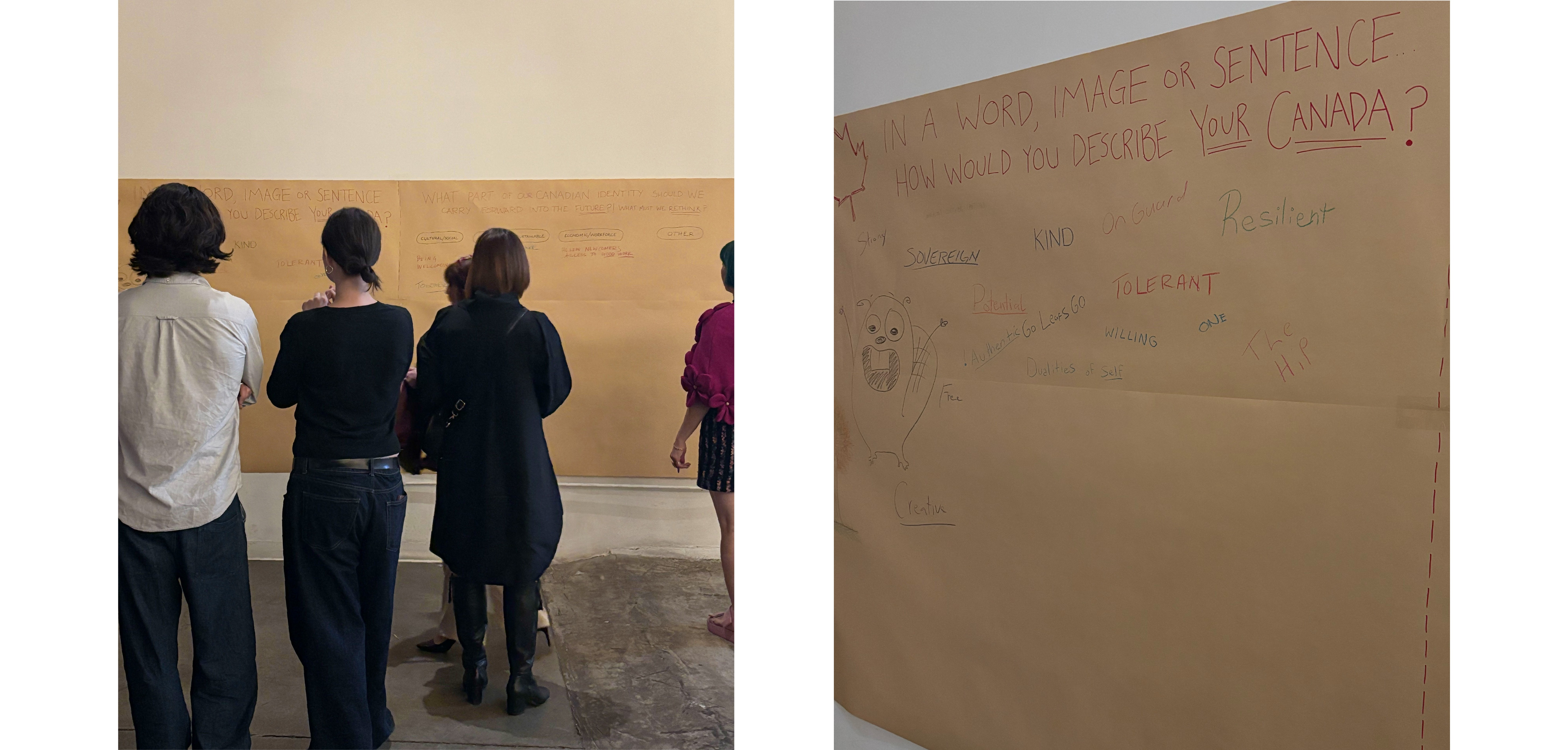
The conversation touched on the power—and volatility—of national symbols. Greg reflected on the Canadian flag’s changing significance in recent years, especially following the pandemic and political polarization. “For a while, I felt like we lost the narrative. That beautiful flag was gone” he lamented. But the takeaway, he added, is that we all have a say in what our symbols mean — especially if we weren’t there when they were created.
Looking Ahead: What Would the Next Chapter Be?
When asked if he would do anything differently, Greg paused. He’s proud of the film, but he recognizes that the next chapter of Canadian design would look very different. He mentioned emerging symbols like the “We the North” campaign and questioned which of today’s designs might stand the test of time. “I want to make work that lasts. I don’t care about trends. That’s what this film was about—understanding the philosophy behind enduring design.”

Conclusion: A Shared Story, Still Being Written
This DesignMeets event reminded everyone in attendance that Canada’s identity is not a fixed narrative but a conversation in motion. The film and discussion raised important questions:
- How do we honour the legacy of past designers while expanding whose stories are told?
- What new symbols are emerging and whose voices are shaping them?
- Can design still unify us, even when identity feels fractured?
As Canada continues to evolve, so too will its visual language. And as Greg’s film showed, design isn't just how we see Canada—it's how we imagine what it can become.
—
About Design Meets
Proudly sponsored by Pivot Design Group, founded by Ian Chalmers, DesignMeets is a series of social events where the design community can connect, collaborate, and share ideas. Join us at a DesignMeets event to network, learn, and be inspired.
Sign up for our newsletter to stay in the loop.